Almost there!
This website works best on desktop or mobile.
Tablet support isn’t available yet — please switch devices to continue.
Transport for London (TFL)
A CIF-standard Usability Test case study
This project aims to evaluate the usability and user-friendliness of the TFL website and TFLGo app, and provide redesign recommendations based on the findings.
This project primarily focuses on applying the CIF methodology to conduct comprehensive usability tests, gather both quantitative and qualitative performance data, and analyse that data to identify genuine UX issues in the website and the app.
My Role
UX researcher | Research Strategist | UX Analyst | Usability Specialist | Usability Test Moderator | UX Evaluator
Duration
2 . 5 months


Sitemap for existing website

Sitemap for desired website
Key issues
After exploring the website and app I identified the following issues :
TFL Website
-
Complex website navigation
-
Text-heavy pages
-
Links with misleading names
-
Poor information findability
TFLGo App
-
Finding the cost of a journey
-
Poor information discoverability
-
Low content density
-
Having to download a suite of apps to access all the benefits of TFL
-
Getting redirected to the website/browser for certain essential journey planning information

Sitemap for existing app
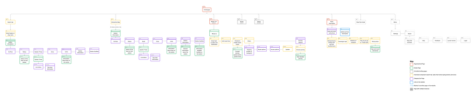
Sitemap for desired app
.png)
Same Issues or New Challenges?
First things first, it was important to understand how users interacted with the app and website to see if they encountered any new issues. I conducted a usability test of the TFL website and TFLGo app.
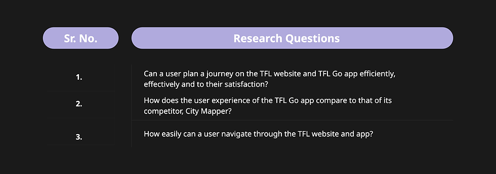
Research questions
I formulated three research questions that were carefully crafted, keeping TFL’s business objectives in mind, to test the usability of the TFL platforms.
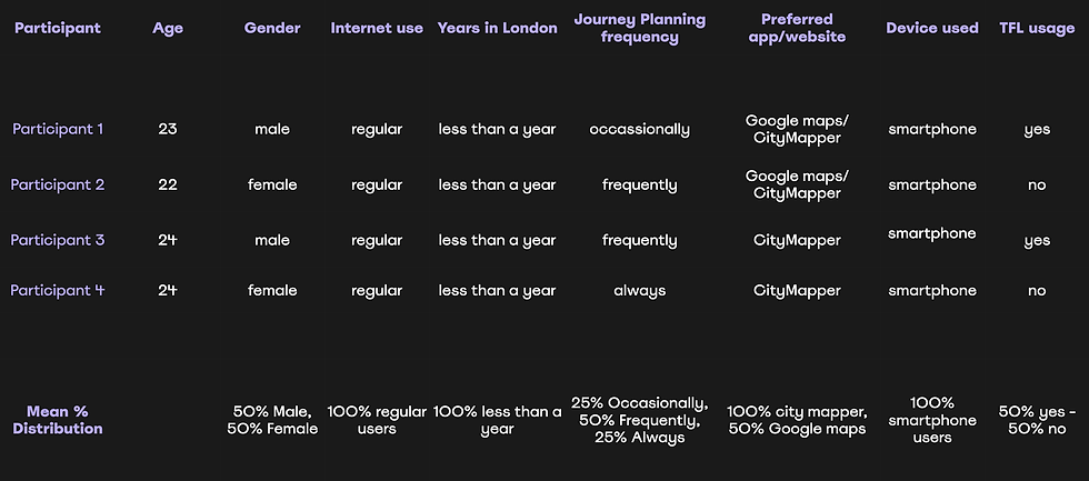
Participants
The test was conducted remotely on Microsoft Teams to ensure the participants’ comfort, allowing them to use their smartphones and laptops to simulate a more natural experience.
Usability Test Tasks
The tasks are closely tied to the research questions and were randomised to enhance the reliability of the test results by minimising bias.

Task Randomisation
Task randomisation enhances the reliability of test results by minimising biases.
1 . Effectiveness: Can users complete the tasks regardless of their order, thereby reducing any biases arising from familiarity with the interface? This can also make the navigation seem easier, interactions quicker, and successful reaching the end state.
2 . User satisfaction: Performing easier tasks first can increase confidence and satisfaction, and starting with difficult tasks can cause frustration. These biases can skew the user satisfaction scores.
3 . Memorability: Will users remember how they navigated on the website, so that they may similarly navigate the app?
Metrics
The usability test was defined on three metrics - efficiency, effectiveness and user satisfaction. A table of constructs and indicators was created to understand how each metric would be measured.

Performance Data
The data collected from usability test sessions, both qualitative and quantitative, was analysed using different methods.
1. Task-Specific Performance Data Tables and Summary of Findings
(One example - method applied across all tasks)
Task:
Find the Cap prices on the TFL Go app
Findings:
-
75% of the participants navigated to the “Where to?” section and tried entering either a zone or an area.
-
25% of participants eventually gave up, saying,
“I don’t think I will be able to find it here”.
-
25% of the participants who used the website first and then switched to the app said that they could confidently navigate to the fares section,
-
while the other 25% said, “I don’t want to remember that”.
And later, “I forgot where it was”.
-
Participants were unhappy and frustrated when they were redirected to the website.

Performance data table
2. System Usability Scale Tables (SUS)
SUS score for TFL website: 44.375
SUS score for TFLGo app: 41.25
-
The SUS scores for both the website and app fall below average, and participants struggled with the system navigation.
-
While users effectively and efficiently planned their journeys, performing other tasks on the website and app proved to be challenging.
-
The scores for both the app and the website are quite close, and 75% of participants found the website to be slightly better in terms of overall user experience compared to the app.
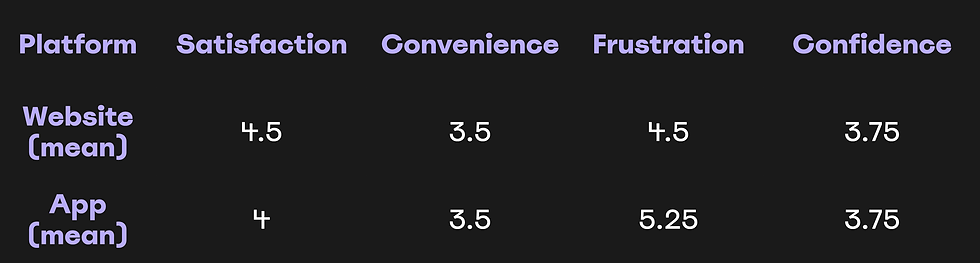
3. Subjective Ratings
The rating is based on a 7-point scale, where participants have to mark their level of agreement with how satisfied, frustrated and confident they felt, and how conveniently they were able to use the website and app.
The Subjective Ratings of participants indicate that
users did not feel confident using the platforms and
felt moderately frustrated.
4. Data Visualisation
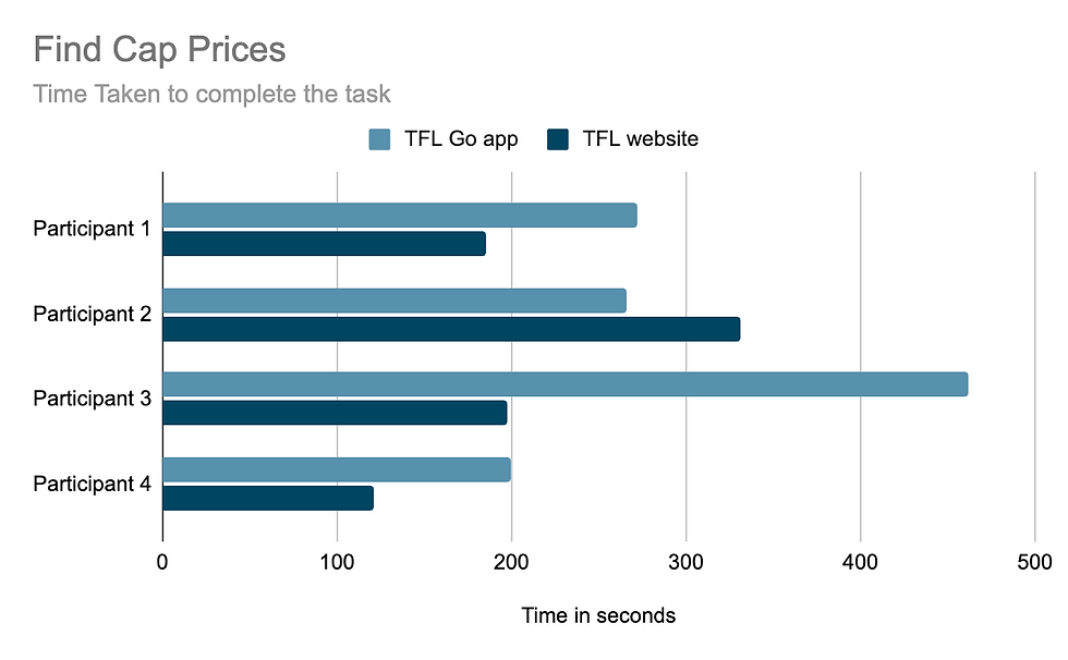
1. The participants who used the app first (P1 and P3) and then switched to the website took significantly longer to find fares via the app since they lacked previous experience with website navigation.

2. 75% of the users took notably more time to find the quieter times on the website compared to the app.
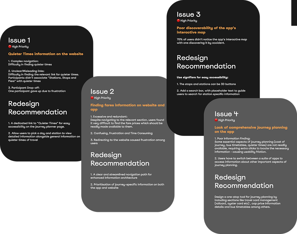
Usability Issues and Redesign Recommendations
I detailed the issues and prioritised them based on how many users they affected and their overall impact on the user experience. I then picked the high-priority issues and suggested redesign recommendations for an improved user experience.
1. Complex and confusing navigation on the app and website
3. The majority of users fail to notice the interactive map on the app
5. Difficulty in understanding graphs on the website due to poor visual representation of data.
7. Lack of comprehensive journey planning on the app
2. Information finding is difficult due to the redundancy of links on the website
4. Inconsistency between Android and iOS systems
6. Information is not readily available, causing users to switch to other apps
8. The website’s cluttered UI and the app’s visually overwhelming map impact their usability
SWOT Analysis
